Finding the best place in the world for wind turbines
the Story of how NASA, ESA and the Danish University of Technology, neural networks, decision trees and other good people helped me to find the best free hectares in the far East, and in Africa, South America and other “so-so”.
the
Like, two years ago, and maybe three, announced the programme of free distribution of hectares in the far East of Russia. Quickly looking at the map, it became clear that just choose the right one hectare is not so simple, and the best and obvious places around the cities, certainly will depart or has already departed local. Perhaps it was at this point I had the idea that it is possible to automate the search for the best places.
Starting to think more romantically, I thought that it is not necessary to look to the far East. Now full of earth, which never needed anyone, but this could change 50 years of commercials, when fossil fuels will come to an end. And people will go to look for new sources of energy. Then I started to look at renewable sources of energy. And very quickly realized that the map resources and territories, where this new energy will produce much change. to Find such places now, you can buy them in advance and be rich later. Figuring I had that for a couple of days off it can easily make... Now looking back, I realize that it took me about a year. I want to say that I do not much understand nor energy, nor renewable, nor machine learning. Below is a brief retelling of my one-year-old project.
the
Having defined the idea, I quickly went to see, and what are all the renewable sources of energy and which one the most energy. This is an incomplete, but the most common list:
But how to determine which one is the best and will win in the future all the rest? after Reading some more interesting articles from the magazines “Science and life” and ”Young technician”. I went to the procedure LCOE (levelized cost of electricity) whose the principle is simple: smart guys are trying to estimate the total cost of a kilowatt-hour of energy, given the production, materials, maintenance, etc. Below the picture according from 2016 with some projection to 2022. I took a picture of fresher here, below boring plate of this document.

All these pictures I have a lot of different countries made by different organizations and everything looks about the same:
Geothermal and hydro I didn't like, because in my opinion, places where it would be possible to extract this energy can be counted on the fingers. The wind and Sun is another thing, so as to put them on almost every rooftop and balcony. The sun was more expensive, and three years ago, the difference was more than 30 percent, I chose the Wind.
By the way, in the middle of a project, I began to encounter documents with similar thoughts of the United States, namely associations NREL, U.S. Department of Energy and others that made predictions on different sources of energy in order to now understand how to modernize the energy system of the country. For example, in one of these documents all came down to several options: the share of wind energy will be a big or very big.
the
The idea of it happening was quite simple and looked like this:
Graphically this plan, as it turned out later, was like this famous picture:
the
First phase was quite easy. I just unloaded all records of points from OpenStreetMaps.
by the Way, I note that OSM is just a storehouse of information about objects worldwide and their coordinates, there is almost everything. So note to fans, OSM is the coolest Big Data source.
It was not very difficult.First I tried using online tools, there seems to overpass-turbo.eu, by the way very cool stuff, but it didn't work due to limitations on the number of points and is not very fast working on a large amount of data. So I had to deal with utilities that unloaded data from a snapshot of OSM data locally. Always deflate the actual cast can be here here? Compressed it takes up about 40GB. It is possible to upload a query with the help of this utility Osmosis. In the end, I got the date set on 140 thousand points on the world coordinates and heatmap. It looked like this:
All the problems started second stage since I don't really understand what information had to collect. So for a couple of days I went into reading the principles of operation of wind turbines and recommendations for their location, restrictions, etc. I Have even left notes here are so funny diagrams about the placement, gradients, winds, wind roses and other helpful terms.

In the end I have put together this list of parameters, which, in my opinion, are important when selecting a location:
the
WIND. Actually, as 90% of all big data projects are broken into stages “so now let's look at your data about which you talked so much,” he cracked and my. Ran to look for the data on wind speed in Russia, I came across this:

And a dozen similar and useless pictures. I started to realize that maybe in Russia there really no wind energy, because there is simply not the wind is blowing in sufficient strength and in that moment, I heard laughter Sechin. But I distinctly remember that in the Samara region alone the wilderness, and very often beyond bread I was blown back to the entrance.
Pogrustim a week, I decided to write Vaisala, Tier3 consulting and other foreign agencies working with the winds and other wind generators, and request data. I thought that by telling what cool idea I'm going to do everything at once I will unload.. Answer only one of the company Sander-Partner. Sander himself gave some tips and also gave the links to what I need: these programs MERRA, who leads NASA. It is worth to note that it took me about a week of evenings to find out what is Reanalysis, WRF, and an idea of what generally happens: collection, aggregation, simulation and prediction of the weather, winds, and other things.
In short, humanity has collected a bunch of data about the weather, drawn a bunch of cards with average temperatures and wind speed, but to gather all the data at each point of the globe as it was, and remains, impossible, therefore, white spots filled with simulation results the weather for the past years and called it a Reanalysis. For example, this site with the visualization of such simulations of wind and this is how it looks:

This data was in fact .csv file grid with an average wind speed with a large pitch, I made this card using the coolest free package QGIS interpolation of mesh data.
And then it is pulled from this map data for wind speed for each pair of coordinates. In fact I got the map and layer data for each pixel on it.
Understand the principle of work with QGIS in about a couple of weeks, I started to build the same card for other data sources and pull the coordinate values. For temperature, humidity, pressure and other things. Here it should be noted that the data sets basically, I took from NASA, NOAA, ESA, WorldClim etc. they are All freely available. Using QGIS did the calculations and finding the distance to nearby cities, airports, and other infrastructure facilities. Each card is one option considered I have about 6-8 hours. And if something was wrong I had to do it again and again. Home computer rustled me at night a couple of weeks, but after that, even the neighbors are tired of listening to a loose cooler on it and I crawled into the cloud, and picked up a small dev to be calculated.
After a few months I came across this site made by the Department of wind energy of Denmark (DTU Wind Energy). It became quickly clear that the resolution is significantly better than my card, I contacted them and they gladly unloaded me the data around the world, because through website you can obtain only small casts at the site. By the way, they also made this card using the simulation of the movement of layers of wind models WRF, WAsP, and obtained permission data to 50-100 meters, as I had about 1-10km.
TERRAIN. Remember, I wrote that the terrain is very important, so I decided to use this option, but it was and is. First, I wrote a utility that was pumping data from Google Elevation API. She did a great job and rocked all my data points all over the world in increments of 10 km, it only took about 12 hours. But I also had options of smoothness of the relief or the average value of the difference of the area around potential points of placement of the windmill. That is, I wanted the data in increments of 100-200 meters around the world, which I would have been able to calculate the average differential.

In order to calculate the differences, it would take a couple of months on pumping data from Google Elevation. So I went to look for other options.
The first thing I found — Wolfram cloud, who already had the necessary data. Simply writing the formula, this thing began to consider using data from the Wolfram cloud. But there I was also waiting for failure, as I found in some limits, which was never stated and having a funny conversation with the support of this service I went to look for another option.
Then I again helped data sources in data from NASA and the space program STRM (NASA Shuttle Radar Topography Mission Global). I have tried to extort from the site, but there the data was only for small areas. Plucking up courage, I wrote NASA a letter and about a week of correspondence, they unloaded me with the necessary data, for which they thank you. Is there really data appeared to be in which tricky satellite binary format that I'm probably a week shoveled.
All ended well, and I felt I needed metrics on the elevation changes for the world in increments of 10 km. by the Way, side I made my service API, which returns the height above sea level coordinates and published it here algorithmia.com/algorithms/Gaploid/Elevation. He works on Azure Tables, where I cleverly put the data and the centers keep them there. By the way, even someone a couple of times bought access to the API, as it is cheaper than Google.
TOTAL. After spending about 4 months of searching, cleaning, calculations in QGIS, I got a date set of data that could be used in the machine learning models. And that contained approximately 20 different parameters in the following categories: Climate, Topography, Infrastructure, the Need or Consumers.
the
At that time I already had some knowledge and understanding of how the machine learning algorithms, but to deploy all of these Pythons and anacondas don't much like. So I used the online service for dummies free from Microsoft Azure ML Studio. Bribed, because it is free and all you can do with the mouse in the browser. There in theory should be a description of how I spent a month on creating models, data clustering and other things. It is especially difficult given all of these clustering since QGIS them very long to do on my old home PC. In the end, the experiment looks like this.
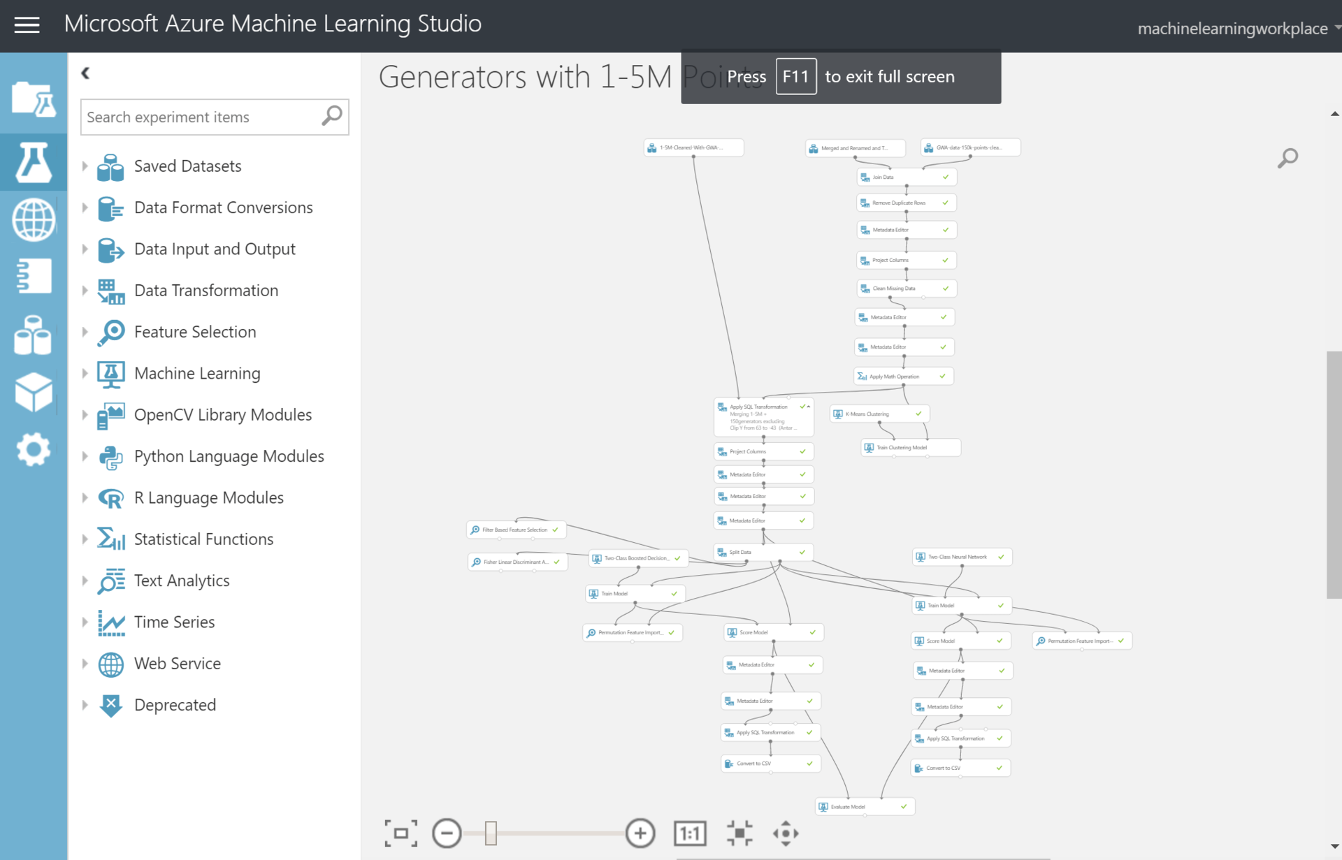
The total number of points that need to be assessed, out of about 1.5 million. Each dot is the area of 10 by 10 km and so the whole world. I removed the cells, which are already wind turbines in a radius of 100 km, and some areas, and got a date set in ~1 500 000 records. Model assessed the suitability of each such box on planet Earth. Used mainly neural networks and boosted decision trees. The accuracy at those points where there are already wind turbines and the fact that predicted my the model is this: Accuracy – ~0,9; Precision -~0,9. What's up, I think, quite accurately as well, or somewhere passed the retraining. From this exercise I got:
the
In total I found about 30 000 the most suitable places (this is a new place where near at a distance of 100 km are not windmills).
the
After receiving 30,000 points with new locations, I visualized and it looks in the form of a heatmap.

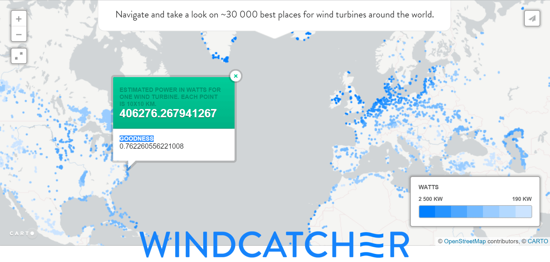
I made a small web site using cartodb to visualize the cards and put the entire map of the world – windcat.ch. I also considered for each point, the approximate energy production from one wind turbine industrial size (50 m). The point here colored according to the amount of energy and not on the evaluation Probability of the model. On each point you can click and there will appear the “confidence” model at this point, I call it Goodness.
I tried to check the veracity of all this an expert way.
Visual inspection: the model predicts dots that trail along the shore that seems to be true, as there will be a good steady wind from the water.
Visual inspection: the cluster of points for the most part coincides in places with good to excellent speed and air density, if you compare with the cards of winds. For example, here Egypt and China:

the
I sometimes write and ask to send more detailed maps of places and explain some things on the map, but nothing more until he comes up with. It is theoretically possible to convert the data is not in increments of 10 km and 100 meters and the idea of the picture can change dramatically, and the idea she will be able to predict not only the area but also a specific point of placement. But it needs some more computing power, which I don't have. If you have ideas of applications I will be glad to hear them.
Article based on information from habrahabr.ru
the
Prehistory
Like, two years ago, and maybe three, announced the programme of free distribution of hectares in the far East of Russia. Quickly looking at the map, it became clear that just choose the right one hectare is not so simple, and the best and obvious places around the cities, certainly will depart or has already departed local. Perhaps it was at this point I had the idea that it is possible to automate the search for the best places.
Starting to think more romantically, I thought that it is not necessary to look to the far East. Now full of earth, which never needed anyone, but this could change 50 years of commercials, when fossil fuels will come to an end. And people will go to look for new sources of energy. Then I started to look at renewable sources of energy. And very quickly realized that the map resources and territories, where this new energy will produce much change. to Find such places now, you can buy them in advance and be rich later. Figuring I had that for a couple of days off it can easily make... Now looking back, I realize that it took me about a year. I want to say that I do not much understand nor energy, nor renewable, nor machine learning. Below is a brief retelling of my one-year-old project.
the
select the type of renewable energy source
Having defined the idea, I quickly went to see, and what are all the renewable sources of energy and which one the most energy. This is an incomplete, but the most common list:
-
the
- solar radiation (solar); the
- wind power (wind energy); the
- the energy of rivers and streams (hydropower); the
- the energy of tides; the
- the energy of the waves; the
- geothermal energy; the
- diffuse thermal energy: the heat of the air, water, oceans, seas and reservoirs; the
- biomass energy
But how to determine which one is the best and will win in the future all the rest? after Reading some more interesting articles from the magazines “Science and life” and ”Young technician”. I went to the procedure LCOE (levelized cost of electricity) whose the principle is simple: smart guys are trying to estimate the total cost of a kilowatt-hour of energy, given the production, materials, maintenance, etc. Below the picture according from 2016 with some projection to 2022. I took a picture of fresher here, below boring plate of this document.
All these pictures I have a lot of different countries made by different organizations and everything looks about the same:
-
the
- In the first place Geothermal energy. the
- On Hydropower, but it depends strongly from country to country. the
- In third place is the Wind.
Geothermal and hydro I didn't like, because in my opinion, places where it would be possible to extract this energy can be counted on the fingers. The wind and Sun is another thing, so as to put them on almost every rooftop and balcony. The sun was more expensive, and three years ago, the difference was more than 30 percent, I chose the Wind.
By the way, in the middle of a project, I began to encounter documents with similar thoughts of the United States, namely associations NREL, U.S. Department of Energy and others that made predictions on different sources of energy in order to now understand how to modernize the energy system of the country. For example, in one of these documents all came down to several options: the share of wind energy will be a big or very big.
the
As I wanted to do
The idea of it happening was quite simple and looked like this:
-
the
- to Find places where wind turbines around the world. the
- to Collect information at these points:
a. Wind speed.
b. Direction.
c. Temperature.
d. Relief.
e. I love lunch by local fishermen.
f. Etc.
the - to Give this information to the machine learning model that would be studied and found patterns which parameters best affect the choice of construction man.
the - to Give the trained model, all points remaining locations with the same information on it.
the - to output a list of those points that are perfect for placing of the windmill.
Graphically this plan, as it turned out later, was like this famous picture:
the
was actually
First phase was quite easy. I just unloaded all records of points from OpenStreetMaps.
by the Way, I note that OSM is just a storehouse of information about objects worldwide and their coordinates, there is almost everything. So note to fans, OSM is the coolest Big Data source.
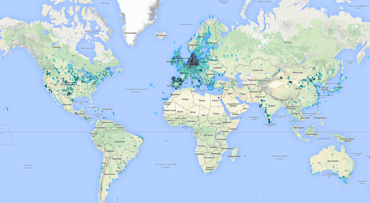
It was not very difficult.First I tried using online tools, there seems to overpass-turbo.eu, by the way very cool stuff, but it didn't work due to limitations on the number of points and is not very fast working on a large amount of data. So I had to deal with utilities that unloaded data from a snapshot of OSM data locally. Always deflate the actual cast can be here here? Compressed it takes up about 40GB. It is possible to upload a query with the help of this utility Osmosis. In the end, I got the date set on 140 thousand points on the world coordinates and heatmap. It looked like this:
All the problems started second stage since I don't really understand what information had to collect. So for a couple of days I went into reading the principles of operation of wind turbines and recommendations for their location, restrictions, etc. I Have even left notes here are so funny diagrams about the placement, gradients, winds, wind roses and other helpful terms.
In the end I have put together this list of parameters, which, in my opinion, are important when selecting a location:
-
the
- Average wind speed per year (ideally 10-11m/c). the
- wind Direction (the Prevailing wind direction-wind rose). the
- Minimum wind speed. the
- Maximum wind speed . the
- Power density. the
- Average temperature. the
- Average humidity. the
- is the Average pressure. the
- Height above sea level. the
- Distance to the water. the
- elevation. the
- Smooth elevation changes. the
- Maximum difference in the area of 5-10km. the
- Percentage of trees or plantings in the area (Cherepovetsky). the
- Distance to the village. the
- Distance to plant. the
- Average number of residents in the area. the
- Distance to the road (sea and air). the
- Distance to electricity supply network. the
- Visual and audible inconvenience. the
- Security: nature reserves and so on. the
- Icing.
the
Big data
WIND. Actually, as 90% of all big data projects are broken into stages “so now let's look at your data about which you talked so much,” he cracked and my. Ran to look for the data on wind speed in Russia, I came across this:
And a dozen similar and useless pictures. I started to realize that maybe in Russia there really no wind energy, because there is simply not the wind is blowing in sufficient strength and in that moment, I heard laughter Sechin. But I distinctly remember that in the Samara region alone the wilderness, and very often beyond bread I was blown back to the entrance.
Pogrustim a week, I decided to write Vaisala, Tier3 consulting and other foreign agencies working with the winds and other wind generators, and request data. I thought that by telling what cool idea I'm going to do everything at once I will unload.. Answer only one of the company Sander-Partner. Sander himself gave some tips and also gave the links to what I need: these programs MERRA, who leads NASA. It is worth to note that it took me about a week of evenings to find out what is Reanalysis, WRF, and an idea of what generally happens: collection, aggregation, simulation and prediction of the weather, winds, and other things.
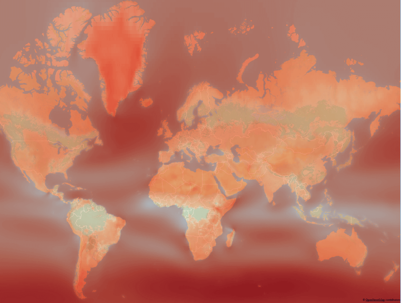
In short, humanity has collected a bunch of data about the weather, drawn a bunch of cards with average temperatures and wind speed, but to gather all the data at each point of the globe as it was, and remains, impossible, therefore, white spots filled with simulation results the weather for the past years and called it a Reanalysis. For example, this site with the visualization of such simulations of wind and this is how it looks:
This data was in fact .csv file grid with an average wind speed with a large pitch, I made this card using the coolest free package QGIS interpolation of mesh data.
And then it is pulled from this map data for wind speed for each pair of coordinates. In fact I got the map and layer data for each pixel on it.
Understand the principle of work with QGIS in about a couple of weeks, I started to build the same card for other data sources and pull the coordinate values. For temperature, humidity, pressure and other things. Here it should be noted that the data sets basically, I took from NASA, NOAA, ESA, WorldClim etc. they are All freely available. Using QGIS did the calculations and finding the distance to nearby cities, airports, and other infrastructure facilities. Each card is one option considered I have about 6-8 hours. And if something was wrong I had to do it again and again. Home computer rustled me at night a couple of weeks, but after that, even the neighbors are tired of listening to a loose cooler on it and I crawled into the cloud, and picked up a small dev to be calculated.
After a few months I came across this site made by the Department of wind energy of Denmark (DTU Wind Energy). It became quickly clear that the resolution is significantly better than my card, I contacted them and they gladly unloaded me the data around the world, because through website you can obtain only small casts at the site. By the way, they also made this card using the simulation of the movement of layers of wind models WRF, WAsP, and obtained permission data to 50-100 meters, as I had about 1-10km.
TERRAIN. Remember, I wrote that the terrain is very important, so I decided to use this option, but it was and is. First, I wrote a utility that was pumping data from Google Elevation API. She did a great job and rocked all my data points all over the world in increments of 10 km, it only took about 12 hours. But I also had options of smoothness of the relief or the average value of the difference of the area around potential points of placement of the windmill. That is, I wanted the data in increments of 100-200 meters around the world, which I would have been able to calculate the average differential.
In order to calculate the differences, it would take a couple of months on pumping data from Google Elevation. So I went to look for other options.
The first thing I found — Wolfram cloud, who already had the necessary data. Simply writing the formula, this thing began to consider using data from the Wolfram cloud. But there I was also waiting for failure, as I found in some limits, which was never stated and having a funny conversation with the support of this service I went to look for another option.
Then I again helped data sources in data from NASA and the space program STRM (NASA Shuttle Radar Topography Mission Global). I have tried to extort from the site, but there the data was only for small areas. Plucking up courage, I wrote NASA a letter and about a week of correspondence, they unloaded me with the necessary data, for which they thank you. Is there really data appeared to be in which tricky satellite binary format that I'm probably a week shoveled.
All ended well, and I felt I needed metrics on the elevation changes for the world in increments of 10 km. by the Way, side I made my service API, which returns the height above sea level coordinates and published it here algorithmia.com/algorithms/Gaploid/Elevation. He works on Azure Tables, where I cleverly put the data and the centers keep them there. By the way, even someone a couple of times bought access to the API, as it is cheaper than Google.
TOTAL. After spending about 4 months of searching, cleaning, calculations in QGIS, I got a date set of data that could be used in the machine learning models. And that contained approximately 20 different parameters in the following categories: Climate, Topography, Infrastructure, the Need or Consumers.
the
Machine learning and prediction
At that time I already had some knowledge and understanding of how the machine learning algorithms, but to deploy all of these Pythons and anacondas don't much like. So I used the online service for dummies free from Microsoft Azure ML Studio. Bribed, because it is free and all you can do with the mouse in the browser. There in theory should be a description of how I spent a month on creating models, data clustering and other things. It is especially difficult given all of these clustering since QGIS them very long to do on my old home PC. In the end, the experiment looks like this.
The total number of points that need to be assessed, out of about 1.5 million. Each dot is the area of 10 by 10 km and so the whole world. I removed the cells, which are already wind turbines in a radius of 100 km, and some areas, and got a date set in ~1 500 000 records. Model assessed the suitability of each such box on planet Earth. Used mainly neural networks and boosted decision trees. The accuracy at those points where there are already wind turbines and the fact that predicted my the model is this: Accuracy – ~0,9; Precision -~0,9. What's up, I think, quite accurately as well, or somewhere passed the retraining. From this exercise I got:
the
-
the
- first point, in which a model said is a great new place for wind turbines. the
- secondly, the point at which the model is told where the seats are not very good.
In total I found about 30 000 the most suitable places (this is a new place where near at a distance of 100 km are not windmills).
the
Result validation
After receiving 30,000 points with new locations, I visualized and it looks in the form of a heatmap.
I made a small web site using cartodb to visualize the cards and put the entire map of the world – windcat.ch. I also considered for each point, the approximate energy production from one wind turbine industrial size (50 m). The point here colored according to the amount of energy and not on the evaluation Probability of the model. On each point you can click and there will appear the “confidence” model at this point, I call it Goodness.
I tried to check the veracity of all this an expert way.
Visual inspection: the model predicts dots that trail along the shore that seems to be true, as there will be a good steady wind from the water.
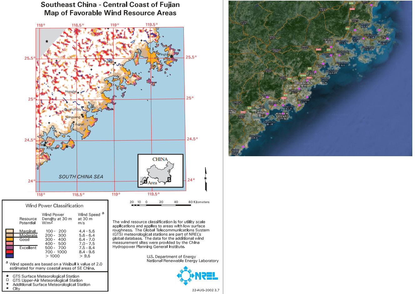
Visual inspection: the cluster of points for the most part coincides in places with good to excellent speed and air density, if you compare with the cards of winds. For example, here Egypt and China:
the
What's next
I sometimes write and ask to send more detailed maps of places and explain some things on the map, but nothing more until he comes up with. It is theoretically possible to convert the data is not in increments of 10 km and 100 meters and the idea of the picture can change dramatically, and the idea she will be able to predict not only the area but also a specific point of placement. But it needs some more computing power, which I don't have. If you have ideas of applications I will be glad to hear them.


Комментарии
Отправить комментарий